Pages

Friday, April 29, 2011

Shabby Chic?


A few weeks ago there was a survey on Mary Fish's blog ( http://www.stampinpretty.com/) asking if you were more of a 'clean and simple' stamper or a 'shabby chic' creator.   The 'clean and simple' won out by a huge margin which isn't surprising since she does such great clean cards on her blog.  I also think the Stampin' Up! look is geared more toward clean and simple.

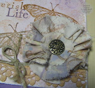
For me, if I had to pick one, I'm a little more toward the clean and simple side although I can't resist putting a lot of stuff on my cards.  However, try as I might, I just can't get the true free form shabby chic look.  This card is about as close as I can get.  Still there is a lot of structure here.  In fact, I made this for the sketch challenge at Splitcoast this week.

One of the joys of papercrafting is that you can try out a lot of different styles to see what fits you.  How would you define your style?  Or do you try?  I think I just want to enjoy a lot of different things and see what takes.


Project notes:  The stamp is inked in Versamark and embossed in Copper embossing powder.  I colored in the flowers with stamp inks and a blender pen.

The background is one left over from another set of cards. It is stamped and inked on watercolor paper.

The ruffle is a piece of lavendar sheer from one of my discontinued sample books.  I gathered as I went on the sewing machine and then cut off the bottom with pinking sheers.

Don't you just love those Vintage Brads? These are from Stampin' Up! and are new this year.  I'm already ready to order my second box!

This is going to be my Mother's Day card for my mother this year.  If Mother were a card maker, she would definitely be a shabby chic lady.  Actually she is very elegant with a lot of 'hip and funky' in her clothing.  She is one of those ladies we envy who can throw together a half dozen things that don't seem to go together and Voila! instant chic.

Thanks for visiting today!  I've got a bit more regular work to do and then off to the nursery to buy flowers for my porch - one of my favorite spring rituals.

Ingredients:  Stamps:  Large blossom and lined dots from Hero Arts
Ink:  Versamark, Perfect Plum, More Mustard, Pumpkin Pie
Cardstock:  Pale Plum
Brads:  Vintage from Stampin' Up!
Lace:  Prima

Thursday, April 28, 2011

Pie, anyone?

My friend Karen helped me celebrate my birthday this month with a wonderful lunch out together and by giving me a copy of Martha Stewart’s Pies And Tarts cookbook.  The best present of all was getting to see her as she now lives all the way across the state :-(  Fortunately we were able to celebrate over Easter weekend :-)

As mentioned in an earlier post, I don't acquire a lot of books.  But even with the availability of recipes on the Internet, I like to have some cookbooks from trusted sources (Martha, Southern Living) on my shelves.  


After our lunch I browsed this wonderful cookbook and tried to find a recipe that I’d didn’t want to make.  They all look fabulous!  Almost every pie would be welcome at our table although this is definitely contrary to my husband’s shape up resolution.  And I don't think my 'get moving' resolution was meant for travel between the stove and refrigerator.

 I realize I’m reviewing this cookbook without actually having baked anything out of it.  It does look though like there are many different kinds of pies some complicated some really, really simple.

Now I’m certainly not going to be like that lady featured on Martha Stewart show who, bless her heart, baked her way page by page through the entire Baking Handbook.  I’m sure though that I will make a few of these pies if only I could decide where to start.  My dad and my husband’s birthdays are still to come and I have promised Karen a pie the next time she comes home.  So I guess I’d better start picking out a recipe.  Should it be the four ingredient chocolate coconut pie that looks like a candy bar in a pie shell or the rhubarb crumble (my husband is a big fan of rhubarb) or one of the savory pies they can be used for a main course, or my favorite coconut cream? Ah, so many choices.  What a good problem to have.


I promise to post a photo of a completed pie as long as no one compares it to Martha's.  Nobody's pies actually come out looking that good, do they?   I'm going for tasty over pretty.

Wednesday, April 27, 2011

Simple Three


One of my blessings the last few days has been all of you new followers and subscribers.  Thank you for visiting with me!  I appreciate your comments and support.

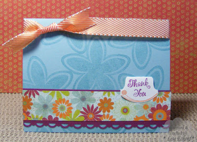
I also need to send a couple of 'thank you' cards this week.  This one is inspired by the Three of a Kind challenge for this week's Clean and Simple card at Splitcoaststampers. I chose to use the same stamps for three similar images.  The flower and leaves are from God's Beauty stamp set.  In my February stamp class here we concentrated on using smaller stamps, often the 'supporting' stamps from a stamp set as the main or only stamp on our cards.  The butterfly is really the star of this stamp set but the flower and leaves are really versatile.

Project Note:  The flowers were stamped with Staz-on black and then masked so I could stamp over them with the leaves in Mellow Moss classic ink.  I then colored in each flower.

Whether you are a new reader or have been visiting awhile, I appreciate your interest in the blog.  Thanks!

Ingredients:  Stamps:  God's Beauty
Ink:  Staz-on Black, Mellow Moss, various markers
Cardstock:  BAsic Black, Mellow Moss, Naturals White
Ribbon:  Source unknown for the green, red is from Basic Grey

Tuesday, April 26, 2011

Been traveling, no tips

We've just returned from a brief, but enjoyable, trip to another part of our pretty state.  As usual our travels included visits to gardens.  We also met some new furry friends who normally make their home far, far away.

I'm just getting my photos downloaded and edited.  The scrapbooking and storytelling will come along in time.

It seems to take so much to get ready for even a short trip, doesn't it?  So I've no tip prepared for today.  Of course my mind was still on crafting even while traveling so I have an idea for next week.

Thanks for visiting today and I hope to have some new projects up later in the week.

Monday, April 25, 2011

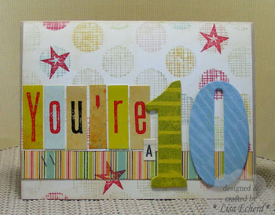
You're A 10!


Actually, he is a 10 in many ways.  Dillon turned 10 years old recently!  Jaime thought it was so cute the other day when Dillon told her, "You know Mom, I'm going to be in double digits."  "Yes, I know, son."  "And," he went on, "This is the only time in my life this is going to happen."

Dillon loves math and science and has a real aptitude for analytical thinking so it isn't that surprising he would know the significance of the number of his big birthday.


I tucked a little something into the pocket inside the card.  My markers got a workout on this card.  The front background stamp is inked in a light ink and then I went over many of the dots with markers.  A lot of huffing went into getting a good image.  I first tried just using markers but couldn't tell where I'd been so that left some 'holes' in the image.  So I had to go to the second approach of inking the entire thing with a light color ink so I didn't miss any spots. The numbers are painted and then stamped for a tone-on-tone look.

Happy Birthday, Dillon!  Here's hoping you get to turn triple digits in 90 years!

Ingredients:  Stamps:  Line dots by Hero Arts; Alphabet Soup by Stampin' Up!; Hearts and Stars by Autumn Leaves
Cardstock:  Kraft
DSP and sticker:  October Afternoon

Saturday, April 23, 2011

Books - Layout using stamped journaling


Lenny and I are regulars at the local library.  We have cards for the library in the next county over as well.  While I can see the value of a Kindle or Nook, I still like holding a regular book and flipping the pages.  Mostly, I still like reading for free.  (more money for travel and scrapbooking supplies :-)  It is one of life's simple pleasures and something those of us in developed countries should never take for granted.

For this page, I used some techniques from Nichol Magourik's 2 Peas class on stamping on your scrapbook pages.  This month we were to stamp some of our journaling.  This was a particular challenge as I have very few word stamps that aren't card greetings.  It was suprising though to find how many of those card greetings could be adapted to a layout particularly if you were doing one about holidays, families or a loved one.  I found a stamp that said "Imagine" and one that for "explore" which I think are very applicable to books.  I also used a little phrase from a Define Your Life stamp about the joy of simple things.


The two journaling blocks are stamped as well and then the journaling printed on.  Both are new stamps to me and I know they will get a lot of use.  So I went ahead and set up a Word document with the right spacing to print properly.

The words "we read" are from a new Ali Edward's set. They are colored in with markers. I love these messages as they really mix and match although I was sort of expecting the stamps to be larger.  I stamped the numbers for the date.  Finally, I got to break out my alphabet stamps which get very little use when I inked "BOOKS."


Also on the page is a found object - literally.  I found the library checkout card laying around.  My husband found it in an old library book and had been using it as a bookmark.  I've been saving it for a page like this since it was for a book called:  A likely story.  It is positioned so the signatures remain covered.


Whew!  That is a lot of stamping.  Oh and I forgot the flower, it was stamped on vellum.  I do love to stretch my supplies and it was a fun layout to put together.  I've worked on it off and on all week as I had time and cooperative joints and muscles.

Thanks for visiting!

Ingredients:  Stamps:  Ledger from Hero Arts; Worn Journals and Perspectives by Ali Edwards by Technique Tuesday; Fabulous Flowers by Hampton Arts; Flourishes by Autumn Leaves; Define your Life by SU!; Spring by Inkadinkado
Ink: various including Prussian Blue by Colorbox; Antique Linen by Ranger; Riding Hood Red and Bermuda Bay by SU!; Timber Brown by Staz-on
Ribbon:  Stampin' Up! and Basic Grey; Prima
Sticker:  October Afternoon
DSP:  Cosmo Cricket's Material Girl; October Afternoon 8x8 pad

Friday, April 22, 2011

Sun and Clouds


My back and shoulder muscles have been challenging me for several months.  Thanks to physical therapy and some ergonomic changes, things have been getting better the last few weeks. I've even started an outdoor painting project! Some things create more fuss than others and papercrafting can be one of those things, or not, just depending on the day.  The last couple of days, I've needed to find a little easier way of doing things and have stayed away from intricate cuts and coloring.

I decided to make my Cricut do some of the work. I cased this card from Laina Lamb at Two Peas.  Here is her original card set:  die cut cards

For mine, I used SCAL software and the Cricut to cut my clouds and sun. One thing I have no trouble doing is spending ages going through papers and playing with patterns and colors to find good combos. This card is a mix of October Afternoon collections with just a touch of Cosmo Cricket.

This card is really appropriate here today for it has been raining all morning and just now the sun has peaked through for the first time, though I'm confident it won't dry up enough to paint :-)  Hope you are having a great day!

Oh and I got a terrific start this morning when I opened my e-mail and saw that I was the blog candy winner from Rainy's (Susan) lovely blog  Rainy Day Creations.  Thanks, Susan!

Ingredients:  Stamp for greeting:  Inkadinkado  Ink: Prussian Blue by Colorbox
DSP:  various October Afternoon 8x8 pads; Material Girl from Cosmo Cricket
DMC embroidery Floss
Cardstock:  Sahara Sand by Stampin' Up!

Wednesday, April 20, 2011

New Scrapping Goodies

scrumptious Sculpture Flowers from Prima

Campy Trail from American Crafts and Campfire from October Afternoon


'New to me' stamps.  Already used the ledger stamp!


Just a few things mostly from my last Two Peas order.  I got the zebra stripe stamp from Hobby Lobby and haven't used it yet.  I'm working on my second layout with the American Crafts Campy Trails papers.  Normally I'm not a huge AC fan, but I'm really loving these!  And I'm certainly not a camper - I think Motel 6 is roughing it - but we do hike and enjoy parks.  So both of these paper collections will fit in with vacation photos.

What have you bought lately?

Tuesday, April 19, 2011

TIPsy Tuesday - Scored Texture


The layout for my card today is from this week's Clean and Simple challenge at Splitcoaststampers.  I loved Maureen's card which was the inspiration for the challenge this week  Clean and Simple Card Apr 18.  On the lower half of her tone-on-tone background, she had used a texture plate. I don't have any embossing dies or tools so I did my own with scoring and folding.  This is hardly a new technique but I figured it could stand revisiting.

First off, choose a heavy cardstock and then score every half inch or whatever grid size you want in one direction.  Turn and score the other direction:  (I used my Fisker's cutter with the scoring blade.)


Then fold along all score lines:


You can stop at that point or for added emphasis, brush a little of the same or similar color along the scored edges.  Stampin' Spots, ink cubes or those little cat's eye colors are great for this.


This is certainly more time consuming than a texture plate but it nice using tools I had and stretching my supplies a bit further.


Thanks for visiting today!

Ingredients:  Stamps:  God's Beauty by Stampin' Up!; greeting from Cloud Nine
Cardstock and ribbon:  Ocean Tides by PTI
Ink:  Timber brown by Stazon; Soft Sage by SU!
Ranger's Glossy Accents

Sunday, April 17, 2011

Alphanumeric Blog Hop


Hi! Welcome to the next stop on the alphanumeric blog hop!  Can you guess my Letter?  Mel thoughtfully gave me the letter "L" to go with my name.  She didn't even know that my husband's name also starts with an "L."  So I thought I'd do a page to celebrate our likeness in names as well as other similarities and differences with all phrases starting with an "L" verb.

I started with this photo where we made a forward and backward "L" by sitting with our legs stretched out in front of us.  I was really tickled with how it came out.  Only three takes with the self timer - which was good because getting up and down off the ground is not as easy as it used to be :-)


For Lenny's title "L" I used a piece of designer chipboard that had a green leaf print on the front.  I tore off that print, stamped, embossed and chalk inked my own design on the backing to go with all this Fancy Pants paper.  My "L" is cut with the Cricut.


The flower is misted and stamped muslin.  I used some Rose Red ink from Stampin' Up in a mister with a little water and it worked fine.  I've had it laying on my work table forever so was glad to find it a home.

Almost everything on this page is from Fancy Pants Road Show collection.


Thanks for visiting!  My blog is mostly scrapbook pages and cards with the occasional quilt project thrown in.  I'd be honored if you wanted to follow or subscribe.  Happy hopping!


Next on the hop is Sandi at Living Life One Blessing At A Time: http://livinglifeoneblessingatatime.blogspot.com/


Here is a list of all the participating blogs:
Den's Crafty Diary: http://deecie.blogspot.com/
From High In The Sky: http://fromhighinthesky.blogspot.com/
Gallo Organico: http://gallorganico.blogspot.com/
Ginger's Life Of Spice: http://gingerslifeofspice.blogspot.com/
Handmade By Kirsty: http://handmadebykirsty.blogspot.com/
Havoc and Mayhem: http://www.havocandmayhem.com/
Heather's Scraps: http://heathers-scraps.blogspot.com/
Helena's Creative Maven: http://helenascreativemaven.blogspot.com/
Holaday's Happy Hearts: http://holadayshappyhearts.blogspot.com/
Jeant-Jinnag: http://jeant-jinnag.blogspot.com/
Just Jimjams: http://just-jimjams.blogspot.com/
K's Crafty Corner: http://kscraftycorner.blogspot.com/
Life...As I See It: http://jillconyers.typepad.com/
{Life Behind The Purple Door}: http://www.lifebehindthepurpledoor.com/
Lisa E Design Blog: http://lisae-design.blogspot.com/
Living Life One Blessing At A Time: http://livinglifeoneblessingatatime.blogspot.com/
Mary's Musings: http://craftycreation.blogspot.com/
Michelle Loves...: http://michellelovesallsorts.blogspot.com/
Obstinate Pursuit: http://obstinatepursuit.blogspot.com/
Over At Our Place: http://overatourplace.blogspot.com/
Paper Turtle: http://paperturtle.blogspot.com/
Peonies and Pennies: http://peoniesandpennies.blogspot.com/
Random Reflections: http://www.kbwalker.blogs.com/
Rosalind Revival: http://rosalindrevival.blogspot.com/
Scrap Dreams: http://cheriandrews.blogspot.com/
Scrappyjacky: http://scrappyjackylive.blogspot.com/
Scrapworthy Lives: http://www.scrapworthylives.com/
Staring At The Sea: http://fiona-staringatthesea.blogspot.com/
Surefiredaisy Says: http://surefiredaisysays.blogspot.com/
This Kalil Life: http://www.kimberlykalil.com/
This Little Life Of Mine: http://tracyscraftycorner.blogspot.com/
Xnomads' Blog: http://xnomads.typepad.com/blog/

Saturday, April 16, 2011

Don't forget to hop on down!

Photo by Dr Joseph Valks from Freedigitalphotos.net

Tomorrow is our alphaneumeric blog hop!  Today I'm finishing up the project I'll post.   Be sure to stop by or go to Mel's blog on Sunday to start at the beginning:   I Speak Melsh: http://ispeakmelsh.blogspot.com/

See you tomorrow!

Friday, April 15, 2011

Daytime Drama

Do you love a good story?   I bet you do.  After all, we wouldn't write and read blogs or scrapbook our lives if we didn't love to read and tell stories.  I have a sad one but it can have a happy ending- you see, with this story we are in charge of the ending.

We had a great time in card class last night - full of laughter and crafting.  Just as everyone was going out the door, my husband came in from his office and announced that ABC was cancelling All My Children and One Life to Live.  I don't think anyone in our group watches these particular shows but for me it put more than a damper on the evening.  I'm angry and appalled that ABC would axe two long running dramas for cheap talk TV.  (Notice, I did not say surprised.)

I held my breath as I asked the fate of General Hospital (GH); for now it is staying.  I started watching GH 3 years ago.  I was a life long viewer of only one soap at the time - As the World Turns but it's days were numbered (It went off the air this past September.)  Also, it was this time of the year when I was facing a summer of reruns  and reality TV.  I don't watch a lot of TV.  I don't like background noise, so the TV is only on when being watched.  The only thing I watch in daytime is the one soap or daytime drama.  Most but not all evenings I watch one show - a half hour comedy or a drama.   We watch the national news and Jeopardy. Otherwise the TV is off.

My post today isn't just a complaint about what ABC and all the other networks have done.  It is to encourage readers to consider tuning in to one of the remaining daytime dramas.  If you already watch AMC or OLTL, I'm very sorry and I understand your disappointment.  Keep watching.

I doubt those shows can be saved; however the remaining daytime dramas can be.  Most people like a good story.  This is evident in the increasing number of books being sold, particularly via the Nook and Kindle.  It is also evident in almost all television programming.  When NBC  tried their "Leno experiement" they lost a huge audience and are now scrambling to add dramas to bring viewers back.  Almost all primetime programming is serial based - even the reality TV.  Viewers want to see what is going to happen from week to week - they apparently want the background story.  The crime dramas that have succeeded in recent years are ones where the regular characters have an on-going story.  Almost every woman I know and quite a few men watch "The Good Wife."  It may have a changing legal story but it is the on-going stories we watch the show for.  We all love a good story.

No genre tells a story better than daytime dramas or "soaps."  If you don't have time to watch during the day, all are available via their network's website on-line.  My Mother has missed her beloved Young and the Restless for a few days but I know she will be down here over the weekend to "catch up" via the Internet.

The acting in daytime dramas is superb.  The writing is far better than most of primetime.  The delivery is consistent.  Soaps don't do re-runs (except on holidays and other rare occasions).  If "The Good Wife" were a daytime drama we wouldn't have to wait 6 months to find out what Alicia was going to say to her husband and her friend about their affair.

For now, I've gone on long enough.  Just think about the summer.  I know you are busy but I also know you, like all of us, need some downtime and a distraction.  If you love a good story, try General Hospital on ABC, Days of our Lives on NBC, or Young and the Restless or Bold and the Beautiful on CBS (the latter is only a half hour).  If you have never watched or haven't in a long time, I think you will be surprised at the quality of the programming.   Enjoy a good story.

Thursday, April 14, 2011


Hope you are having a wonderful spring day! My husband has yard worked planned for today; the grass is really growing.

The flower base for today's card is a chipboard flower covered in pattern paper.  I used an emory board to sand the edges.


Coming up Sunday here on the blog, I participating in my very first blog hop!  The idea came from Mel at http://ispeakmelsh.blogspot.com/ The other bloggers and I are each taking one letter of the alphabet and doing a post about our letter.  You'll have to visit Sunday to see which letter I have and what I'm doing with it.  I'm excited to see what all the other participants do as well.


Thanks for visiting!

Ingredients:  Stamps:  On Your Birthday by SU!
Cardstock:  So Saffron
DSP:  October Afternoon 8x8 papers mostly Farm Fresh
Brad:  Build a Brad by SU!

Tuesday, April 12, 2011

TIPsy Tuesday - From Rags to Riches


One of the techniques for using Ranger distress inks is to press the ink pads directly on an acrylic block or a craft sheet and spritz with water.  Then dip paper (I use watercolor paper) into the inks for a background.  You can do this repeatedly on the same paper for more color.  

Eventually, you need to wipe of the acrylic block or the craft sheet.  I've been using a paper towel and I always notice what pretty color combos you get on the paper towel. I wondered if you could get similar results with fabric?  So I tried wiping the ink off my craft sheet with a piece of plain muslin. 


Here is my 'dyed' piece of muslin.


Before using it to make the flower below, I stamped the flourish in Vintage Photo.


And you get a really interesting fabric to make a flower or other embellishment.

I did find that I still needed a paper towel to get the surface completely dry.

The remainder of the card was inspired by a tag Tim Holtz made for 2 P's month of cardmaking and stamping.  I layered a lot of different stamps and mostly used distress inks for a soft, worn look.

Thanks for visiting today, Happy Tuesday!

Ingredients:  Stamps:  God's Beauty, Baroque Motifs by Stampin' Up!; Line dots by Hero Arts
Ink:  Vintage Photo, Tea Dye, Concord Crush, Weathered Wood, from Ranger
Cardstock:  Plum Pudding by PTI
Lace:  Prima
Brad:  Vintage from Stampin' Up!

Monday, April 11, 2011

Studio Wall Quilt


The room that I use for paper crafting is our guest bedroom.  It has a wonderful high cathedral ceiling that brings in beautiful morning light.  Opposite the wall with a window is another high wall which until this week held and old wall hanging I made for my stepdaughters back when mauve, green and a country look were popular.

About I’d say five years ago(?),  I made a wall quilt top that was the perfect size for this space in the guest room.  I kept putting off quilting it until I mastered free form quilting on my machine.  While I’d like to tell you that I finally quilted it because I have indeed mastered machine quilting, the reality is I got awfully tired of the old wall hanging and was ready to finally finish decorating this room.  (It is pretty bad for someone in my profession to have a room with nothing matches.) I realized that the wall hanging would be so far up above eye level that not one would really see my quilting!  I did a fairly decent job (though certainly not masterful) after I ripped out some of my first work.  Most importantly I got it done and here it is - something a bit more modern and in colors that match the room.


The quilt is composed of 2 inch squares sewn together.  This is similar to the process of watercolor quilting which I fell in love with several years ago.  However my hands do not allow me to use a rotary cutter.  I don’t know why but I can cut with scissors; however, a couple of minutes with the rotary cutter and my hand just aches.  Anyway, to piece together my hand cuts slightly off squares I rely on a wonderful product called Quilt Smart  http://www.quiltsmart.com/.  It is fuseable interfacing with a 2 inch grid.  So you have a terrific background  to lay out your project and add a great way to hold everything together to make sewing easy and best of all accurate.

My goal with this room is to have only handmade items for wall art. This is the only thing I have up so far so I have quite a ways to go. My next task is to get my uncle to build me a picture ledge to hold completed scrapbook pages. 

I hope you'll stop back by tomorrow for Tipsy Tuesday. Also coming up next Sunday I am participating in my very first Blog Hop. It's very exciting what we're up to - more details to follow up… 

Sunday, April 10, 2011

Looking Up


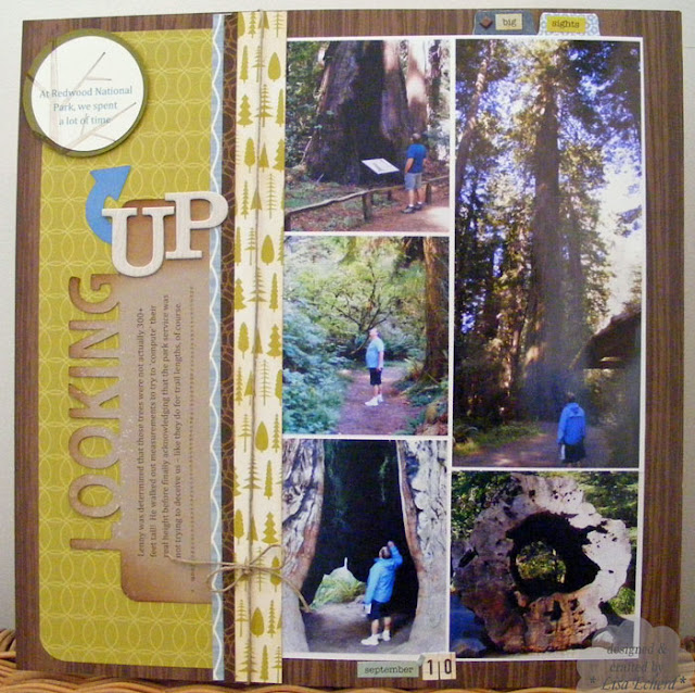
It was funny.  I picked this sketch challenge because of the photo collage.  I thought I would just use a variety of our hiking photos from Redwood National Park.  When I started laying out the photos, I noticed a pattern.  Lenny was looking up in so many of the shots.  I guess we did a lot of that surrounded by some of the tallest trees on the planet!

It is another of the Joys of Papercrafting that you really notice patterns when you start playing with your photos to create a page.

Anyway, I thought it made a good subject so I concentrated on just the photos that emphasized the size of the trees.  Here is the journaling:


Lenny was determined those trees were not actually 300+ feet tall!  He walked out measurements to try to 'compute' their real height before finally acknowledging that the park service was not trying to deceive us - like they do for trail lengths, of course.

Have you ever noticed that hiking trails are way longer than they are posted for?  I guess it could just seem that way, but I think it is how they measure.  I know we have walked at least 4 miles when the trail only says 2 :-)

As for the layout, I already had many of the photos printed so I made my own collage.  I did a Panorma (see this post for details on doing that in PSE) for the tree.  I didn't realize until I printed it that I'd picked an option which resulted in my husband being slightly taller than he really is - and thinner too.  I'm sure he won't mind.


I used SCAL and the Cricut to cut the title like the one in Nichol's sample.  The edge is distressed in Vintage Photo and stamped with a little Whisper White using the Itty Bitty Backgrounds stamp.

For the sketch that goes with this layout, see the weekly challenge at Two Peas - Apr 8 '11 Challenge

Thanks for visiting today!

Ingredients:  Campy Trails DSP by American Crafts
Stamps:  Stitches by Hot of the Press, Woodgrain by Hero Arts and Season of Friendship by SU!
Ink:  Soft Suede, River Rock
Cardstock:  Crumb Cake
Stickers:  On Holiday from The Girls Paperie
Chipboard:  Basic Grey

Wednesday, April 6, 2011

My SU! experience - then and now

First, today's card.


We have card class coming up and I have mostly floral cards for the group to make.  So I thought we needed a masculine card and I turned to the old favorite little truck stamp which most of the ladies have in their collection also known as Loads Of Love.  Splitcoaststamper’s color challenge this week is to use Pear Pizzazz, Baja breeze, and Poppy Parade - such happy colors.  I also used the sketch challenge turned up on its end.  In place of the circles which would probably be brads or buttons I embroidered X’s for some extra love on this simple card.

Doing this card using all Stampin Up supplies fit in well with one of my first activities this morning which was looking back two years on my blog.  Now that sounds like something strange to do.  It came from Shimelle’s prompt from the Blogging for Scrapbookers class.  She suggested that we use our blogs if we’ve been doing this a long time to see how things have changed in the last year or two years or whatever.  A blog is a great way to find something by date.

So I went back to April 2009 which was shortly after I started my blog.  It was also shortly after I began my few months as a stamping up demonstrator.  I was pretty passionate about stamping and using Stampin’ up! products.  Now I still loved to use other manufacturers’ paper but I had not ventured out into a lot of different kinds of inks.  I was trying to encourage others to stamp, just starting to participate in challenges, and just beginning to teach some card making classes.


Now two years later I still use a lot of my Stampin Up collection of stamps and the inks and markers.  I use their cards stock almost exclusively now except for a little bit of Papertrey Ink.  I have though expanded the variety of stamps and inks in my collection.  I’m a pretty brand loyal person however I like a lot of variety in my crafts.  I get bored pretty quickly and I find that has increased as I’ve gotten older.  For example when I was younger I loved to crochet and while I tried out a lot of different patterns I had some that I would make over and over again.

Now I find that I want to try more and more new techniques, scrapbooking layouts, scrapbooking subjects.  I love to watch videos on techniques and see what I can learn.  I’m not as adventuresome as some of you but I really like to stretch my style.

While I didn’t really like trying to sell Stampin Up, I am very grateful for my time as a demonstrator.  When I had to meet a quarterly minimum, I gave myself permission to spend a bit more money on my crafts –cutting back in other places to do so.  I realized how important paper crafting was to me.  I had to produce quite a bit of product –cards and pages to show to perspective clients.  So I really increased how much I got done in my crafting space and that has carried over even though I’m not trying to sell anything anymore.

I still teach some classes.  We use a lot of SU materials but of course we use a lot of other products as well.

Whereas I was just getting started entering card challenges, I now enter several challenges a month many of them for scrapbook pages.  I make a lot more one page layouts these days.

I really think that blogging, reading other blogs, watching You tube videos, participating on message boards has helped me grow as a crafter.  I’m very thankful to all the wonderful crafters I connect with online.

Thank you for visiting today!


Ingredients:  Stamps: Loads Of Love
ink and card stock: Baja breeze, pear pizzazz, poppy parade 

Tuesday, April 5, 2011

TIPsy Tuesday - Filling in the Letters


Typically, I throw those little inserts from from my raw chipboard in a bin. One of these days there will be a TIPsy Tuesday on what to do with those, when I figure it out :-)   Today's tip is a simple and hardly, original one.  You can color in the middle of the "p", "e", "o", "a", "g" etc and add a little more punch to your title.

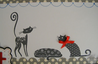
For "pet", I painted the letters red and the middles gray.  After the gray dried, I stamped in white craft ink to go with all the other polka dots on this page.  You could also cover them in pattern paper or just use pattern paper behind the centers of your letters.  It just adds a little bit of fun.


For the rest of the page...

the layout is based on Shimelle's sketch for her 4x6 Photo Love class in March.  I opted for the 4x4 version of the photos.  Otherwise, I stuck pretty close to her example.  See the class here:  4x6-photo-love-with-shimelle-laine/  For one of the journaling spots, I created my own with the Cricut.

It was great getting some use out of my scallop stamp set.  I keep forgetting I have it.  This Cats set from Inkadinkado has been used quite a bit.  Colorbox fluid chalk ink does such a great job!   The bow on the kitty is not in anyway meant to imply that MY cat would wear such a thing.  If I tried to put a bow on him, I'd be needing serious bandages on me!


Journaling:

"Daddy can open doors, he can actually get Jasper to respond the word "Out," and he can get out the fake bird for a game of catch any old time.  But when it comes to love, Mommy is the only one who gets to pet the cat."  For some reason, Jasper does not really want Lenny to pet him.  Oh well, it's his kingdom and we only live here.

Thanks for visiting today, hope you will come back soon!


Ingredients:  Stamps:  Cats by Inkadinkado; All Scallops by SU!  Ink:  Charcoal by Colorbox; Brocade Blue by SU!
Cardstock:  Brocade Blue
DSP:  Cherry Hill's Sunday Dishes by October Afternoon
Ribbon:  All by Stampin' Up!
Stickers and Chipboard by Basic Grey

Sunday, April 3, 2011

Three Thanks from One Stamp


It is stamping and cardmaking month at Two Peas in a Bucket!  The first video and challenge was to make three cards using one stamp - using the stamp a different way in each.  I chose a simple flower image and did these three things:

  • For the card on top, I stamped the back side of DSP and cut out the orange flower and the front side of another DSP with only the edge colored in and cut that out as well.
  • For the next card, I stamped the flower image in Baja Breeze on Baja cardstock over and over to make a background.  This was a little more time consuming using a wood mounted stamp since I had to use the Stamp-ah-mah-jig.  It would be a piece of cake with an acrylic stamp.
  • Finally for the card below, I stamped in Versamark and colored with pastels.  After cutting it out I inked the edges with a little Rich Razzleberry ink.  It sort of looks like the white part is stamped but is is just the background paper. 

So you really can get a lot of mileage out of one simple stamp!

I also used the same DSP and greeting stamp set to keep the decision making process to a minimum.


Thanks for visiting me today!

Ingredients:  Stamps:  Office Accruement by Stampin' Up!; Spring Blossom (greetings) for Inkadinkado
Ink:  Baja Breeze, Rich Razzleberry, Versamark; Pastels by Stampin' Up!

Saturday, April 2, 2011

Nature's Painted flower


If I colored a stamped flower in like this, people would probably say I was nuts!  Yet, here is a white and red combined Camellia.  I love it when people ask me "Did you grow these?"  I always respond, "we planted the bush" because truly that is all we did with this multi colored camellia.  It was recommended by our favorite garden center.  I don't think we have ever even pruned it.  It just produces beautiful pink, white and red bloom all on the same bush. Sometimes you even get mixed colors within the same bloom!

Such a bright sunny day here in NC.  It's windy though so the perfect day to finish cleaning my sunroom when the sun gets on that side of the house and warms things up.

I even get a break from the kitchen today, my hubby is cooking lunch!  And I hear him doing dishes already.  Heaven!

Hope you are having a great weekend, too.

Friday, April 1, 2011

April Opportunities


Happy April!  Much is going on in the on-line papercrafting world.  It seems most of the challenges I follow haven't been posted yet. I'm sure they will be up in the next day or two.  Here is one that is:

Scrapbooker's Anonymous challenge to use eyelets:  April Challenge Eyelets  Oh boy!  Eyelets?  I'm not sure what I have but I'll give it a try.  The Crop-a-dile will get some exercise.

Also, Two Peas in a Bucket launched a change to their website yesterday along with a video that explains they are really expanding their product offerings.  I'm excited to see what they have in store for us in the stamping and cardmaking world.  This month they are doing a month long card making/stamping event.  www.twopeasinabucket.com/


Now for my layout...
On Tuesday I posted tips on how to create a panoramic photo in Photoshop Elements.  Here is the layout that goes with that picture.  It is more from the gardens in Northern California.  The journaling explains how I really planned a portion of our trip around seeing this particular garden and was very concerned when we got there because it did not look like that much from the roadside entrance.  Fortunately you can’t judge a garden by its entrance.  It was absolutely gorgeous once we got inside.

Project notes:
I created the flowers using tips from an article in Scrapbook etc. magazine.  I punched the flowers with the scallop punch, spritzed some with water, and crumpled them up.  I also used tips from a Tim Holtz video tutorial for creating your own glimmer mist.  However I must’ve got a little carried away with my Perfect Pearls because these are really glimmering!  Clearly, more playtime is required.

Happy, no fooling, day to you!

Ingredients: DSP: Karen Foster design and check by October Afternoon.  Colorful designer papers from a variety of sources.
Chipboard: Ashley by Maya Road; swirl by Oriental Trading
Brads: vintage breads and Vanilla Hodgepodge Hardware by SU
Stickers: on holiday by the Girls Paperie.
Related Posts Plugin for WordPress, Blogger...